
No products in the cart.
Bring Premium Value to Your Brand with a Trusted Custom Packaging Manufacturer
Home » Manufacturing » Custom Packaging Printing Methods » Pantone Printing
Pantone printing, mathematically known as the Pantone Matching System (PMS), is a specialized spot-color process engineered for absolute color precision. Instead of overlapping standard cyan, magenta, yellow, and black (CMYK) dots to simulate a shade, our laboratory mixes specific, solid chemical pigments into a single uniform ink bucket before it ever touches the printing press.
Creates flawlessly rich, perfectly opaque blocks of solid background color, entirely eliminating the tiny “grainy dots” or color-separations visible in standard multi-color printing.
Because the ink is mixed to a strict, globally standardized chemical formula, the color output remains perfectly static regardless of atmospheric humidity or raw paper stock variations.
Every individual Pantone spot color chosen requires its own dedicated station on our production line. Moreover, if your design features four corporate Pantone colors alongside a photograph, you will incur extensive plate charges.
Spot inks are mixed to be solid. Subsequently, they cannot be blended together on the press to render continuous-tone photographs or realistic nature graphics.
Protect your iconic corporate colors from looking cheap, faded, or un-matched on retail counters. Your packaging instantly broadcasts high-end, premium retail status that commands higher price tags.
Therefore, since standard desktop scanners and cheap counterfeiters cannot accurately replicate true pre-mixed PMS spot inks through standard CMYK scanning, your unique Pantone packaging serves as an organic security barrier.
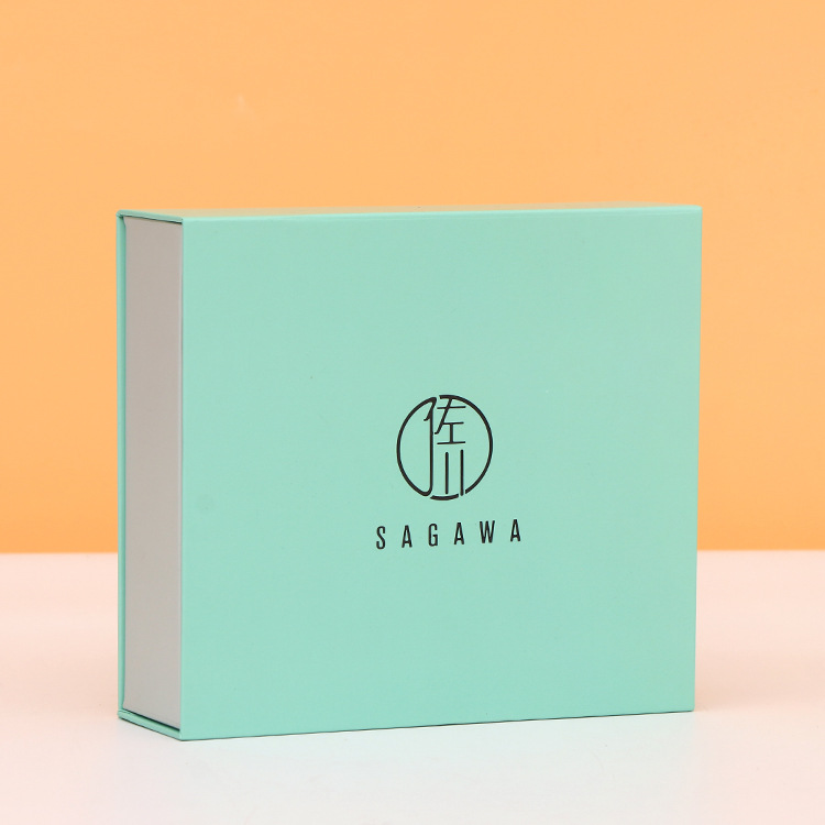
Cover heavy-duty rigid frameworks in a perfectly flat, pre-mixed corporate signature color. Consequently, your premium brand packaging completely avoids digital grain, halftone dot matrices, or CMYK color drifting across international retail channels.
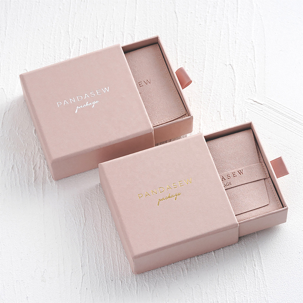
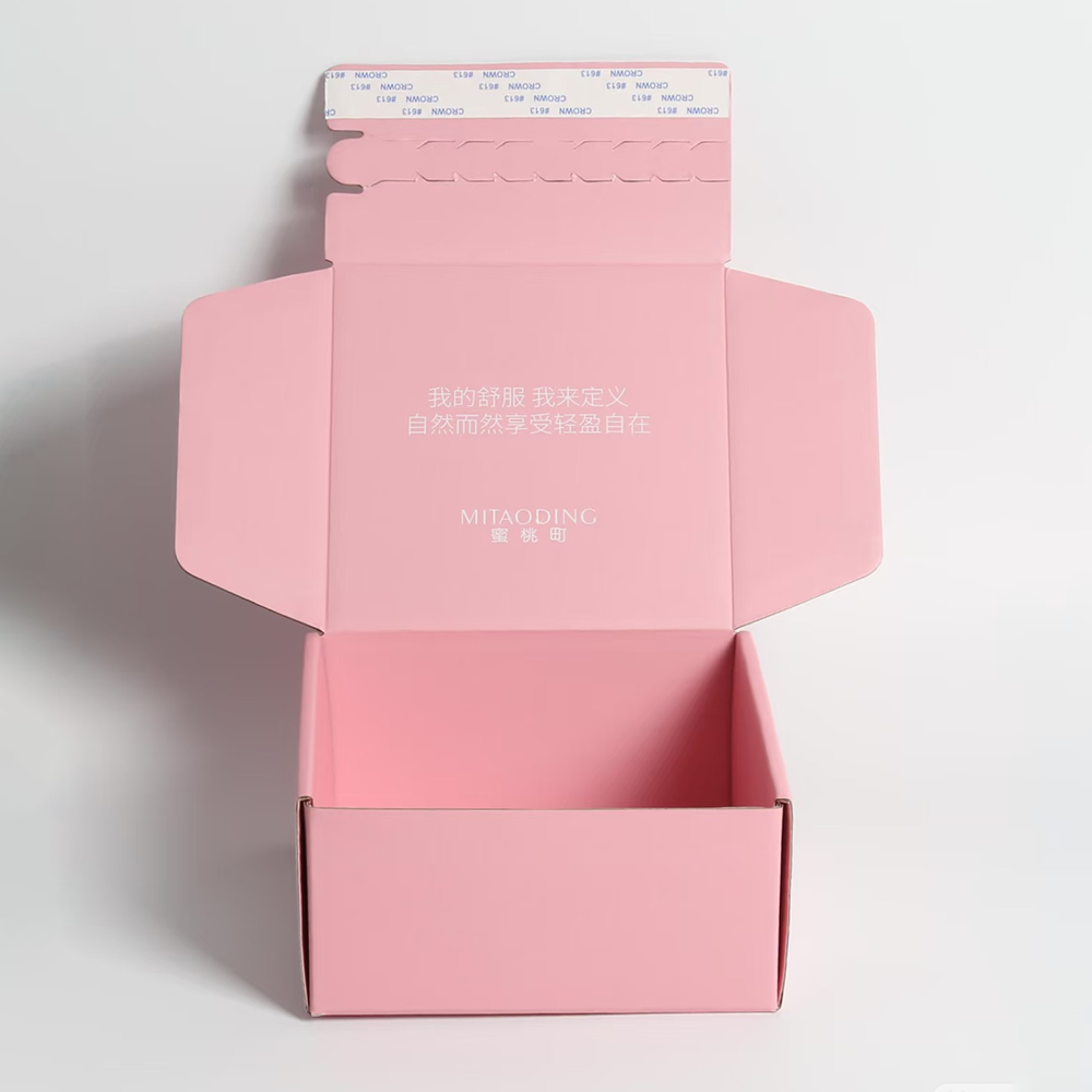
Apply calibrated Pantone spot pigments onto delicate drawer-style sliding boxes. Therefore, sensitive pastel and pale nude hues achieve impeccable solid coverage and absolute batch-to-batch uniformity without any muddy undertones or pixelation.
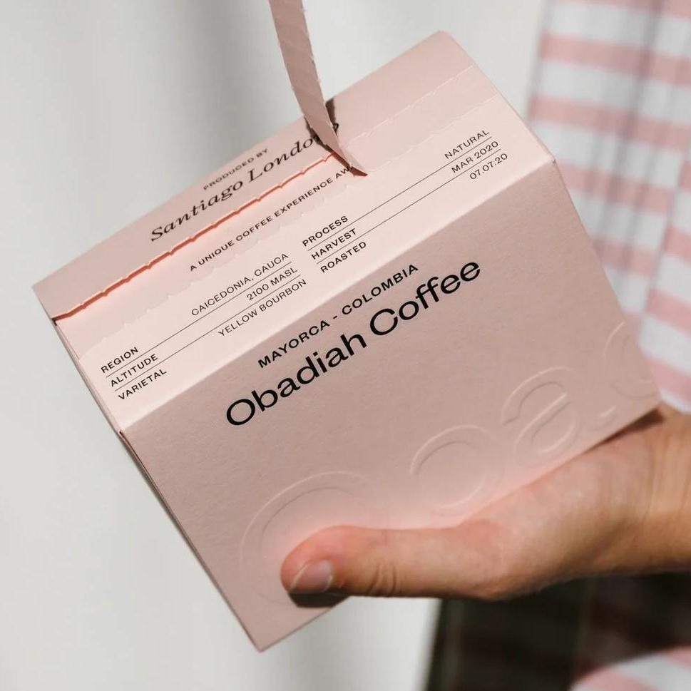
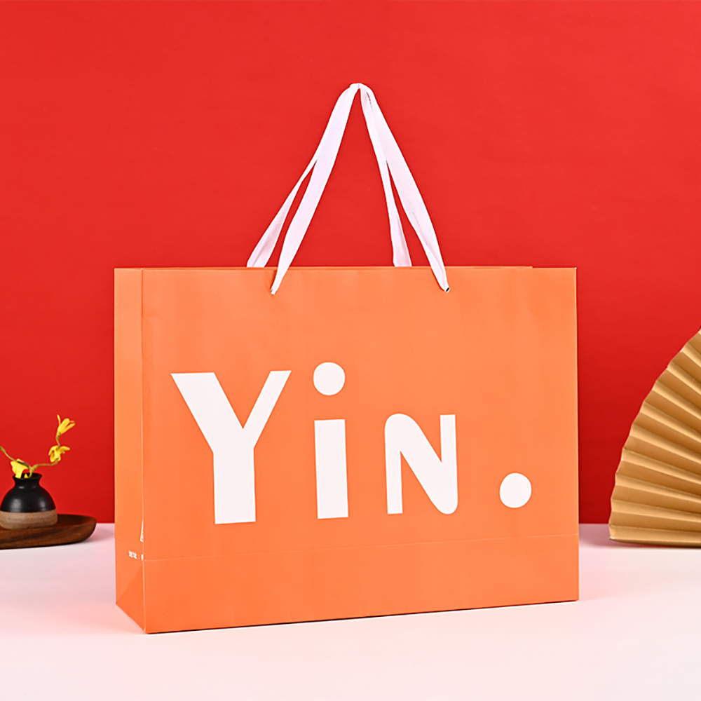
Combine high-contrast structural typography with vibrant PMS solid background blocks on unique geometric coffee and retail packs. As a result, the folding panels and tear-strip zipper components maintain a crisp, premium finish that instantly upgrades the unboxing experience.
Direct-print solid Pantone inks onto premium top liners before laminating them onto structural corrugated fluting. Because pre-mixed spot formulas offer supreme opacity, they effortlessly neutralize underlying dark fiber variances to deliver vibrant, clean interior or exterior solid prints.
Stamp ultra-saturated, fully opaque spot pigments across premium heavy cardstock or uncoated papers. Subsequently, expansive background fields maintain a bold, modern, and luxurious matte presentation that remains entirely free of ink starvation or streaks.
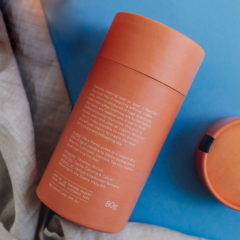
Wrap rigid cylindrical rolled cores in seamless, un-pixelated spot-color sheet liners. Moreover, continuous wrap-around designs, brand narratives, and technical micro-text align perfectly, ensuring zero color transitions or overlapping seam errors when the tube rotates.
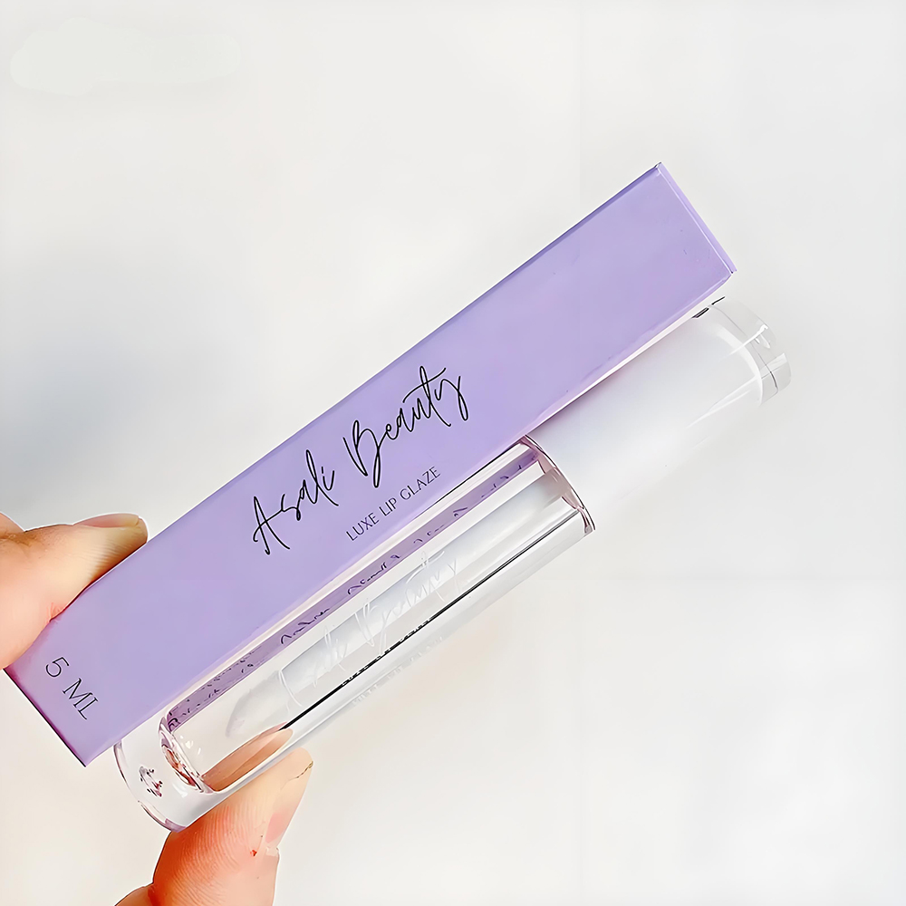
Die-cut high-stiffness ivory board into custom cosmetic tuck cartons using true corporate PMS selections. Instead of dealing with the subtle, volatile color shifting of multi-color grids, your retail cosmetics boxes present completely smooth, pristine, and uniform brand solids.
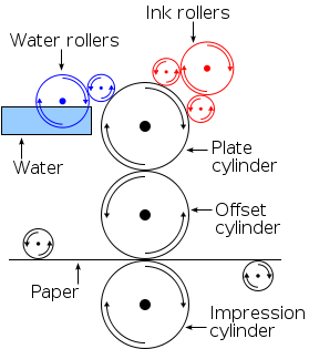
Standard CMYK processing creates colors by printing patterns of microscopic dots from four base inks, which your eye blends together from a distance. Up close, this can leave a grainy texture and can suffer from color shifting. Conversely, our custom Pantone spot color printing utilizes single, pre-mixed liquid pigments blended in our lab to a mathematically precise chemical recipe before entering the press. This allows us to stamp down a perfectly flat, rich, and opaque layer of ink, producing solid spot color retail cartons completely free of halftone dots or grain matrix artifacts.
We hold our production lines to an elite international tolerance benchmark of Delta E < 1.5, a margin imperceptible to the unaided human eye. Our engineering workflow enforces this by equipping our QA stations with premium X-Rite electronic spectrophotometers for blind digital matching. Furthermore, we mandate the use of physical, current Pantone Master Matching Guides (Coated and Uncoated specs) to prevent color drift. Whether your packaging is manufactured this month or reordered next quarter, the pigment output remains perfectly static.
This is an important consideration for brand procurement. Raw unbleached kraft paper has a dark brown base hue and high fiber absorption, which naturally shifts and darkens any translucent ink applied to it. White SBS boards, by contrast, feature a smooth coated surface that holds pigment on top. To protect your brand identity across varied substrates, our engineering team deploys a specialized workflow: we first screen a highly opaque “spot white ink undercoat” to seal the porous fibers and create a neutral background, before applying your precise PMS spot color.
This configuration is highly popular among premium cosmetic and tech electronics brands. We execute this by pairing our advanced multi-station commercial offset presses to run a hybrid layout. We allocate four inline stations to manage the standard CMYK processing for your photographic assets, while dedicating a 5th inline station solely to stamp down your exact pre-mixed Pantone pigment. In terms of billing, this configuration requires a standard four-color plate layout plus a single custom spot plate fee, giving you rich photographic art alongside a flawless brand logo.
Because initiating a true Pantone spot pass requires our pressmen to completely drain the mechanical ink fountains, manually strip and chemically flush the rollers, custom-blend the raw pigments, and execute manual calibration run-sheets, the mechanical wash-down overhead is extensive. Consequently, we maintain a baseline MOQ of 1,000 to 2,000 units for brand accurate PMS packaging boxes. For early-stage startups working with limited capital, we suggest utilizing our high-line-screen CMYK approximation methods to simulate the tone until production volume justifies a true spot-ink upgrade.
Absolutely. At Gerun Packaging, we use premium, certified ink networks (such as industrial DIC or high-stability eco-systems) that are completely free from restricted heavy metals like lead, mercury, cadmium, or hexavalent chromium. All spot formulas deployed are certified to comply with strict European REACH and RoHS regulations, as well as California Proposition 65 standards. We supply full testing documentation upon request to ensure your international retail distribution faces zero legal or regulatory customs bottlenecks.
Do not let inconsistent CMYK color separations dilute your hard-earned luxury brand equity on global retail shelves. Lock down absolute visual authority with the proprietary color-formulation laboratory at Gerun Packaging.
Lock in Your PMS Specifications: Submit your exact Pantone Matching System (PMS) color codes along with your target paperboard selections (e.g., Bleached SBS, Recycled Kraft, or Coated Kraft Back).
Request a Laboratory Swatch Proof: Secure a calibrated ink drawdown swatch verified under industry-standard X-Rite spectrophotometers to achieve a guaranteed Delta E < 1.5 across your entire international distribution network.
Consult with an Ink Chemist: Speak directly with our technical ink-mixing team to engineer specialized high-opacity base layers for challenging or dark substrate fibers.
Tel:+86 13723475723
Add:building 10, zone 14th, taoyuanju, xixiang street, Bao'an district, Shenzhen, 518126, China
Connect us by scan whatsApp

CUSTOM PACKAGING SUPPLIER FOR COSMETIC, GIFT, FOOD AND SHIPPING | 2026 COPYRIGHT BY GERUN PACKAGING
Tell us your packaging requirements and receive a reply within 12 hours.